The Glade 4.0
https://gladerebooted.net/

need some help creating a headstock logo
https://gladerebooted.net/viewtopic.php?f=5&t=6113
Page 1 of 2

Author:  Midgen [ Thu Apr 28, 2011 2:42 am ]
Post subject:  need some help creating a headstock logo

I need some advice from some of our more creative types.

I am just putting the finishing touches on a FrankenStrat project and want to put a custom headstock logo on it. (it's actually a close reproduction of David Gilmours 1984 Red '57 reissue)

I have a pretty good idea what I want the logo to look like, I just can't quite get what I want using software I am familiar with and already own (i.e. MS Word :p)

Basically I want the logo to be similar in style to Fender's logo. Italicized and stylized script text, gold or silver in color with a black outline.

I don't want to use the same font, but a similar stock font would probably suffice ( I was looking at Segoe Script in MS Word and it looks like it or something similar would work...)

Once I get the design done, I'll be printing it on waterslide decal paper (either Inkjet or Laser, still TBD) and the spraying a thin coat of clear lacquer over it.

Sooo, my question is, what software would I need to create something like this?

Here is Fenders headstock logo's over the years, to give a general idea what I'm trying to create...
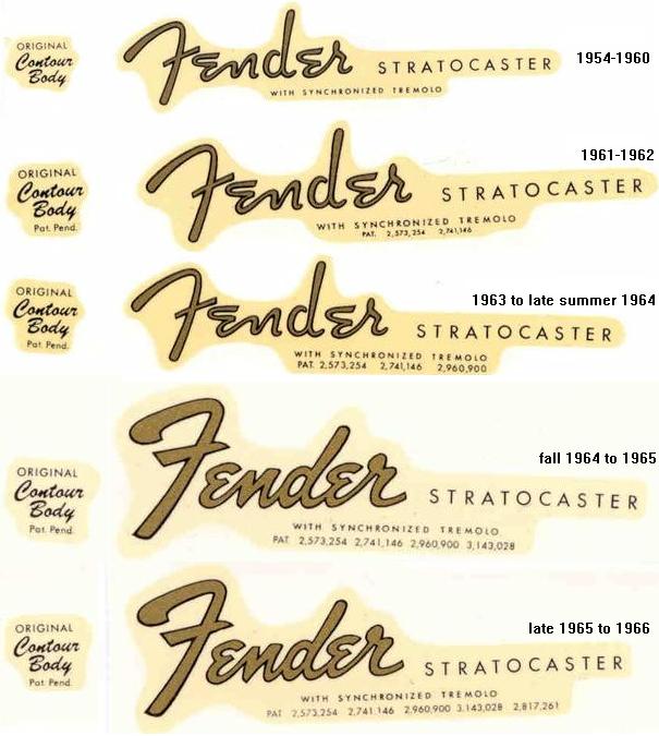
Image

And here is a decent close up (of a different guitar, same headstock shape), that gives a good general idea of the look i'm going for.

Image

Thanks in advance for any help...

Author:  Müs [ Thu Apr 28, 2011 4:30 am ]
Post subject:  Re: need some help creating a headstock logo

Attachment:
midgencaster.png
midgencaster.png [ 18.68 KiB | Viewed 3460 times ]

Something like this?

Author:  Hopwin [ Thu Apr 28, 2011 8:21 am ]
Post subject:  Re: need some help creating a headstock logo

Müs wrote:
Attachment:
midgencaster.png

Something like this?

Hehe

Author:  Mookhow [ Thu Apr 28, 2011 8:25 am ]
Post subject:  Re: need some help creating a headstock logo

Müs wrote:
Attachment:
midgencaster.png

Something like this?

:thumbs:

Author:  Darkroland [ Thu Apr 28, 2011 10:11 am ]
Post subject:  Re: need some help creating a headstock logo

Müs wrote:
Attachment:
midgencaster.png

Something like this?


holy crap that has the limited edition whoseaflobitz! Hellls yeah

Author:  Midgen [ Thu Apr 28, 2011 11:07 am ]
Post subject: 

That is... AWESOME !!

(how did you do that?)

Author:  Nevandal [ Thu Apr 28, 2011 1:55 pm ]
Post subject: 

Haha, Midgencaster!


I would totally buy one

Author:  Müs [ Fri Apr 29, 2011 9:15 am ]
Post subject:  Re:

Midgen wrote:
That is... AWESOME !!

(how did you do that?)


Just whipped it up real fast in photoshop. Using the Segoe Script font for the first part, and the rest is Trajan Pro.

The outline is just a drop shadow centered behind the letters and made opaque. If you want, I can put in any words you want, and size it appropriately to print pretty.

Author:  Micheal [ Fri Apr 29, 2011 9:28 am ]
Post subject: 

The Mus is under-appreciated. He has skillz.

Good stuff antler guy.

Author:  Müs [ Fri Apr 29, 2011 9:57 am ]
Post subject: 

Jack of all trades, master of none ;)

Author:  Midgen [ Fri Apr 29, 2011 10:19 am ]
Post subject: 

Thanks Mus,

I was hoping to avoid Photoshop. :-/

Thanks for the offer, but I think I'm going to give this a try myself. It's something I need to be able to do.

I remember doing some stuff like this in Paint Shop Pro years ago. I might give that a shot (if it's still around).

Thanks again...

Author:  Ulfynn [ Fri Apr 29, 2011 11:11 am ]
Post subject: 

Would Gimp be able to accomlish this? It's free: http://www.gimp.org/

Author:  Lenas [ Fri Apr 29, 2011 11:40 am ]
Post subject: 

GIMP is very capable of doing this.

Midgen, make sure that anything you want to print out is 150 to 300 DPI when creating it. Most graphic programs will set the default at 72 DPI because that's screen resolution, but you want higher when printing.

Author:  Midgen [ Fri Apr 29, 2011 12:32 pm ]
Post subject: 

Thanks guys, this is exactly the kind of tips I was looking for.

I remember using Paint Shop/Paint Shop Pro for this kind of stuff many years ago. But I think that program kinda went south when Corel bought it out.

I'll check out GIMP... thanks

Author:  Lex Luthor [ Fri Apr 29, 2011 1:06 pm ]
Post subject: 

GIMP is difficult to use... watch out.

Author:  Stathol [ Fri Apr 29, 2011 1:31 pm ]
Post subject:  Re: Re:

Müs wrote:
Using the Segoe Script font for the first part, and the rest is Trajan Pro.


Müs wrote:
... and the rest is Trajan Pro.


Müs wrote:
... Trajan Pro.


:p

Author:  Darkroland [ Fri Apr 29, 2011 1:31 pm ]
Post subject:  Re:

Midgen wrote:
Thanks guys, this is exactly the kind of tips I was looking for.

I remember using Paint Shop/Paint Shop Pro for this kind of stuff many years ago. But I think that program kinda went south when Corel bought it out.

I'll check out GIMP... thanks


For free stuff, I actually prefer paint.net. It's not as robust as some, but much more useable, and you can get away with it for most things (for everything else, there's photoshop) :)
http://www.getpaint.net/

Author:  Midgen [ Fri Apr 29, 2011 1:57 pm ]
Post subject: 

I was just messing around with GIMP and found a few tutorials on the web. I think I can manage this...

So I have 'inexperienced newb' question here (maybe for Lenas?).

The Color Laserjet 4700 I will probably be using is 600x600 dpi.

Since I'm creating these images specifically to be printed, would I make the image resolution the same as the printer resolution? Or is that much detail not necessary?

Darkroland, I may give that a look too. Thanks...

Author:  Lenas [ Fri Apr 29, 2011 2:09 pm ]
Post subject: 

To give you a baseline, 300 dpi is the quality of a high-end magazine. For most applications, anything higher than that is unnecessary.

When creating a new document, you're going to want your canvas size a little bit larger than what you want to print. For example, if I was going to be making those decals 6 inches long by 3 inches high, I'd probably leave an inch of white space around my graphics for cutting/trimming after printing with a document size of 7 inches by 4 inches. This space is referred to as the slug.

Yeah I'm a web guy but my first degree was in print design ;P

Author:  Stathol [ Fri Apr 29, 2011 2:37 pm ]
Post subject:  Re:

I always like to work at a multiple of the print resolution (ex. 1200dpi, 1800dpi, etc. in this case), and then create my final print document by down sampling it to the print resolution myself. That ensures that the final print version is nicely anti-aliased at the final resolution, and keeps me in control of the whole process. Regardless, I like to work with a higher resolution source just for the sake of future-proofing. Say that 2 or 3 years from now you want to use this logo on another guitar, only then you have a 1200dpi printer. What then? Whereas you can always down-sample an image to a lower resolution if you need to, you can't truly go the other way around.

Author:  Mookhow [ Fri Apr 29, 2011 2:39 pm ]
Post subject: 

When in doubt, 999999999999999999dpi.

Author:  Lenas [ Fri Apr 29, 2011 3:00 pm ]
Post subject: 

Unless we plan on having bionic eyes in the future that can see printed dots at a higher resolution than 300dpi, there's no reason "future proof" these logos. Something printed at that res is going to look seamless from anywhere further than like a foot away.

Author:  Kaffis Mark V [ Fri Apr 29, 2011 3:00 pm ]
Post subject:  Re:

Lex Luthor wrote:
GIMP is difficult to use... watch out.

No it's not.

Author:  Midgen [ Fri Apr 29, 2011 3:02 pm ]
Post subject: 

Heh, the first test I created was reasonably sized on my screen, but when I printed it, it was about 1/4" wide on paper.

I figured out what i was doing wrong (in the image properties). I think I'm on the right track now.

Thank you everyone for the input. Hopefully something reasonable will come from it.

NinjaEdit:

I think before I get serious about headstock logo's, I need to make a full sized template of the actual headstock, including the tuner holes, string ferrules, and using the appropriate base color for a background (beige/maple :p) etc... This will make visualizing the final product a lot easier.

Ok, looks like I have some work to do. :p

Thanks again everyone.

Author:  Midgen [ Sat Apr 30, 2011 7:41 pm ]
Post subject: 

Whee...

Hit the motherlode with headstock templates here..
http://www.ask.com/wiki/Headstock

Now the hard part... to come up with a design :p

Page 1 of 2 All times are UTC - 6 hours [ DST ]
Powered by phpBB® Forum Software © phpBB Group
https://www.phpbb.com/